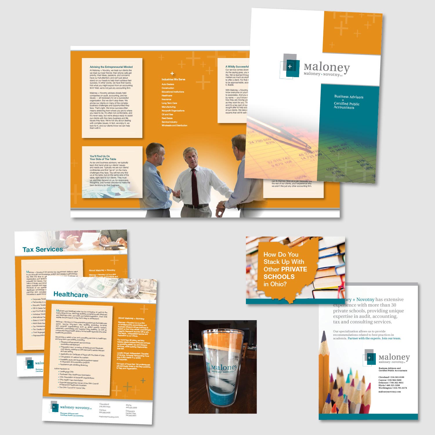
These pieces were created for Maloney + Novotny, a Cleveland based firm of certified public accountants and business advisors. Working off of the "+" in their logo, I established this look with blocks of color and accounting related images. Orange was added to enhance the teal and gray of the Maloney + Novotny logo.
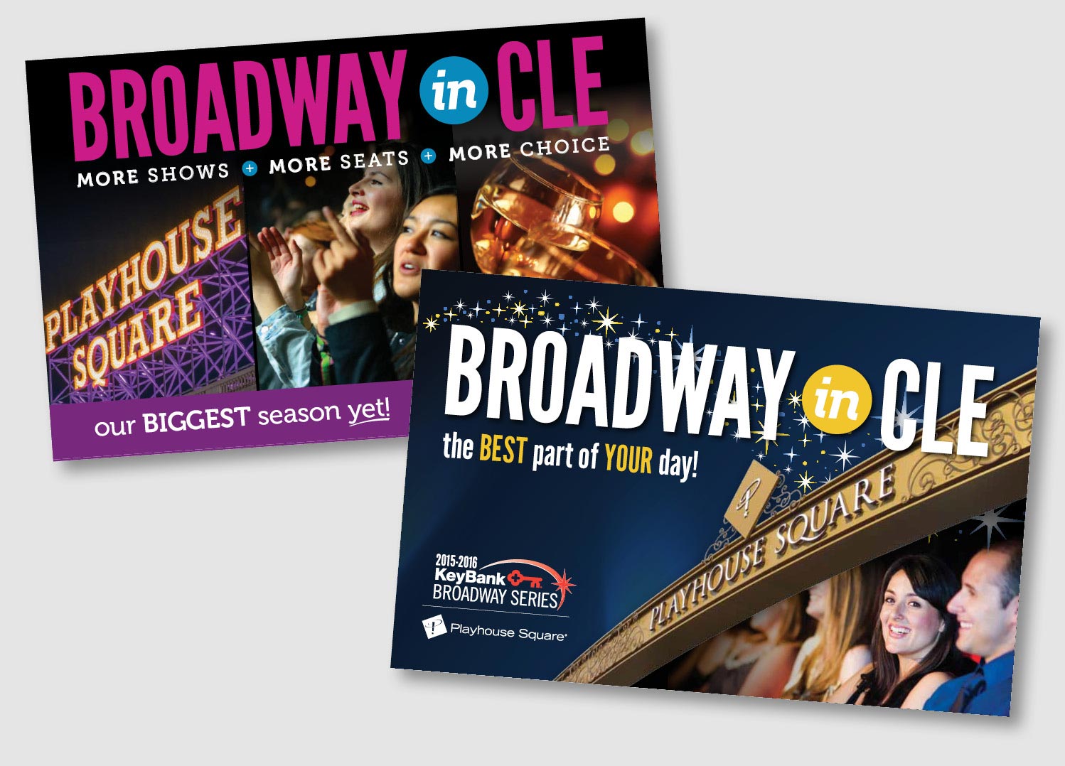
The Playhouse Square Broadway Series highlights architectural elements from the newly renovated downtown Cleveland area along with images of theater participants enjoying the show. These mailer covers develop the theme that is carried through out the season.
work completed for type + design
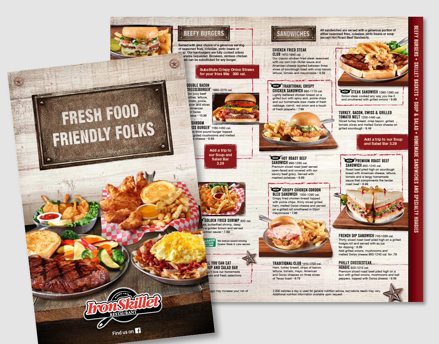
I created a fresh menu look for Iron Skillet, one of the restaurants at Petro Stopping Centers in over 65 locations across the United States. Iron Skillet originated in Texas and they wanted to keep the feel of home cooked recipes but update the prior menu look. The wood plank backdrop and metal heading plates lead you around the layout but keep the focus on the real star...the food!
work completed for Full Circle Creative
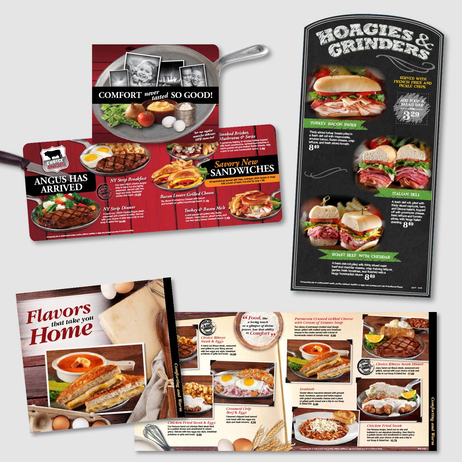
The Country Pride and Iron Skillet menu inserts were created to focus on limited time offerings of the season. These specials are often featured with creative themes that differ from the look of the everyday menu...chalk text on a blackboard, fresh ingredient images that make you think of home cooking and unique die-cuts or short folds.
work completed for Full Circle Creative
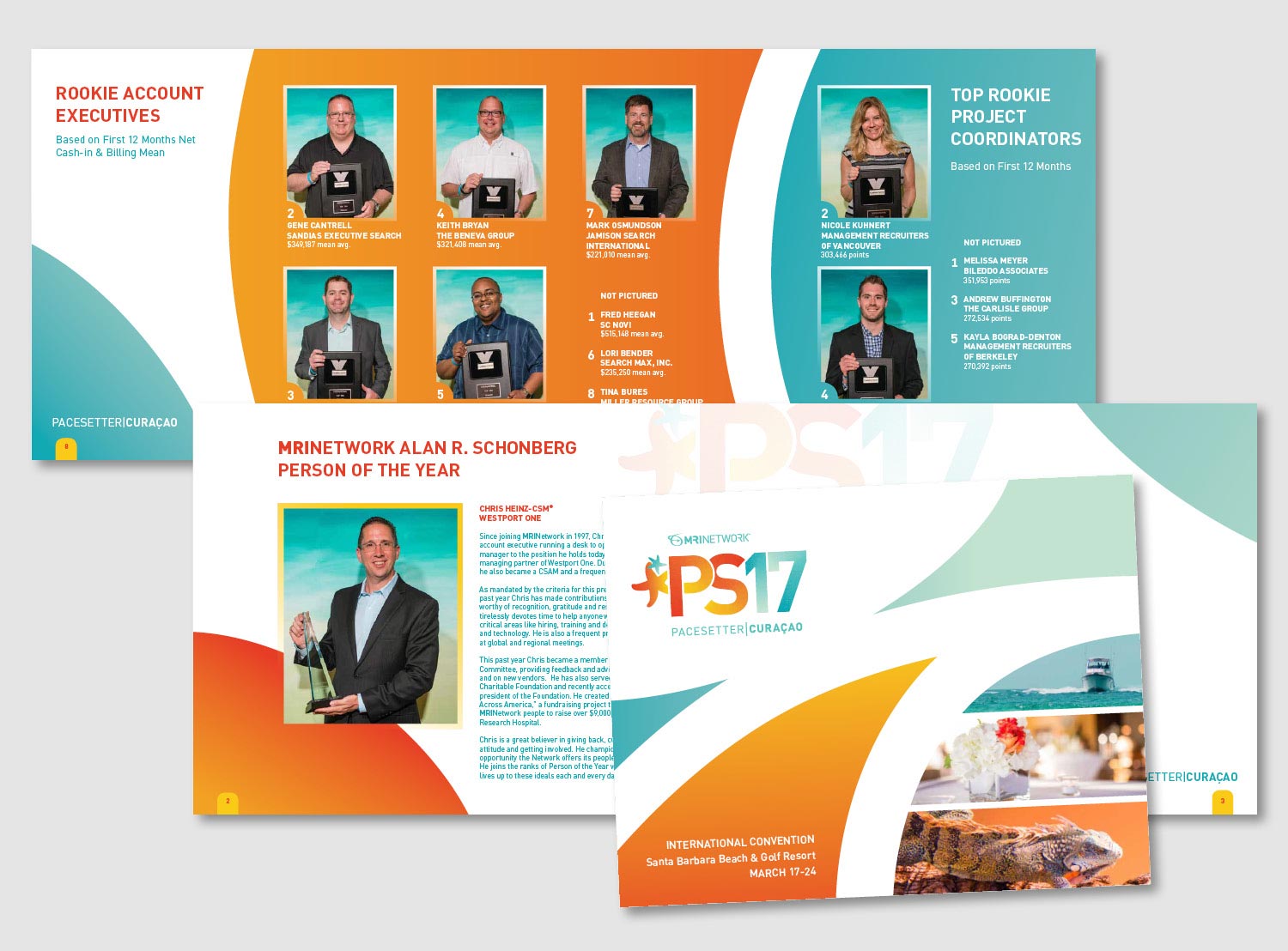
Each year the top recruiters and offices of MRINetwork are invited on a vacation getaway. A commemorative 32 page book is put together showcasing the award winners and events. Waves of tropical sunset orange and sea foam green carry you through the layouts of this annual award book. No two spreads are the same but the colors and shapes flow easily from page to page and make a cohesive piece.
work completed for Full Circle Creative
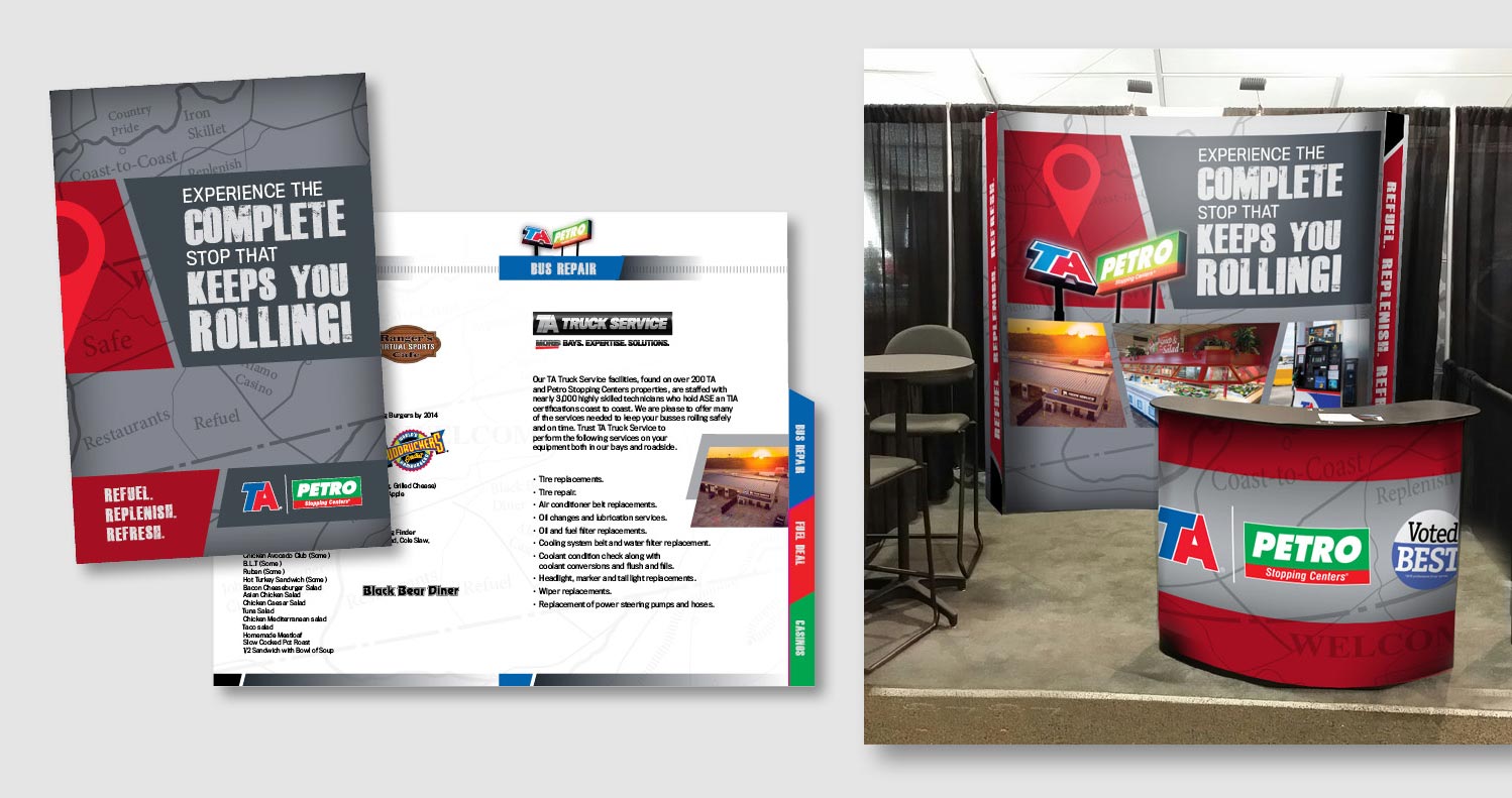
When preparing for a trade show, Travel Centers of America asked for eye catching graphics for their booth and podium as well as a companion spiral bound brochure featuring amenities and locations. The gray background with a darker gray strike through varnish adds a professional touch. The map is continued inside as a screened back element and the red map marker and angled bars ad a pop of color and interest.
work completed for Full Circle Creative
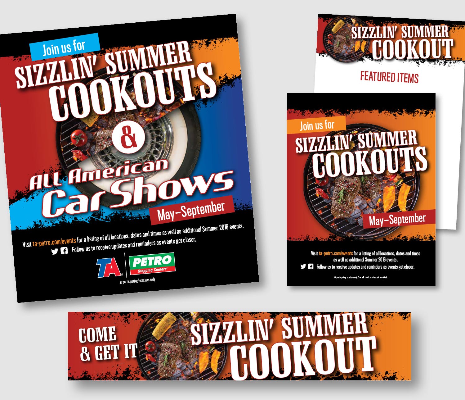
I created a campaign look for special summer events held and Travel Centers of America locations. The pieces are colorful yet call attention to the headlines and important dates or contact information. Campaign pieces included ads, flyers, banners, featured items menu board, etc.
work completed for Full Circle Creative
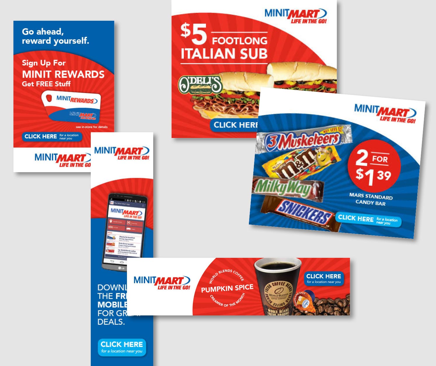
Special offerings from MinitMart Travel Stores at TA and Petro Stopping Centers are often promoted digitally. The red, white and blue color scheme is accentuated with shapes and lines that draw you in to the featured items while leaving plenty of white space to call attention to the logo.
work completed for Full Circle Creative
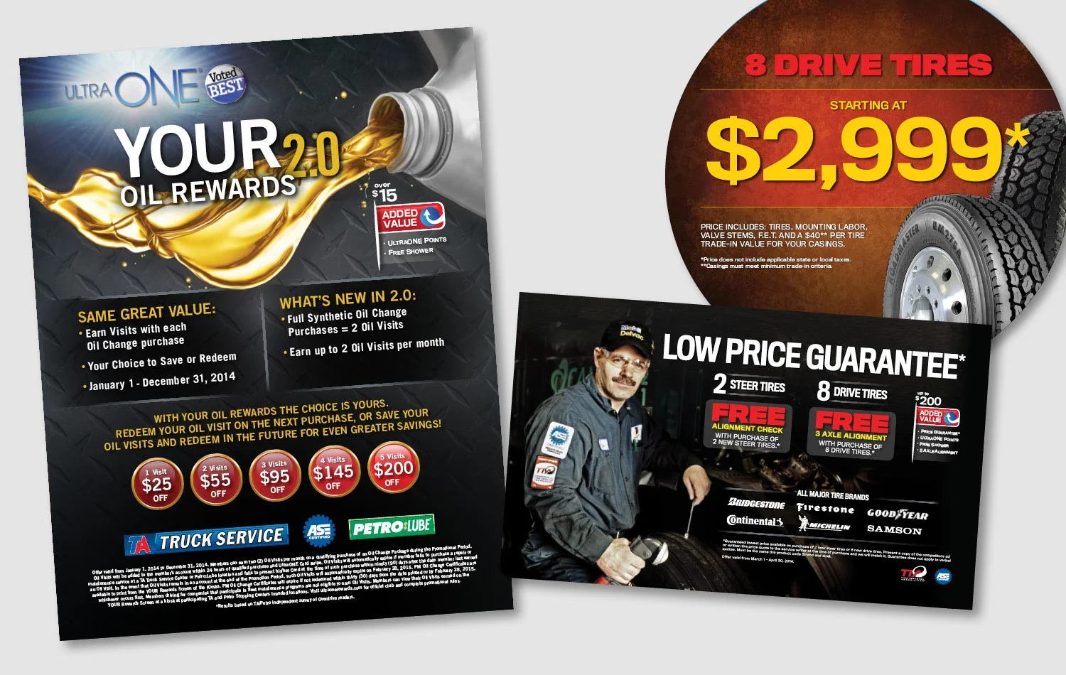
These are a few samples of Truck Service pieces done for TA and Petro Stopping Centers. They offered special discounts on tires, repair and maintenance services or had reward programs for oil changes. The campaigns targeted the trucking industry portion of the Travel Centers of America business with a masculine appeal. Campaign pieces included ads, flyers, point of purchase signs, pumptoppers, etc.
work completed for Full Circle Creative
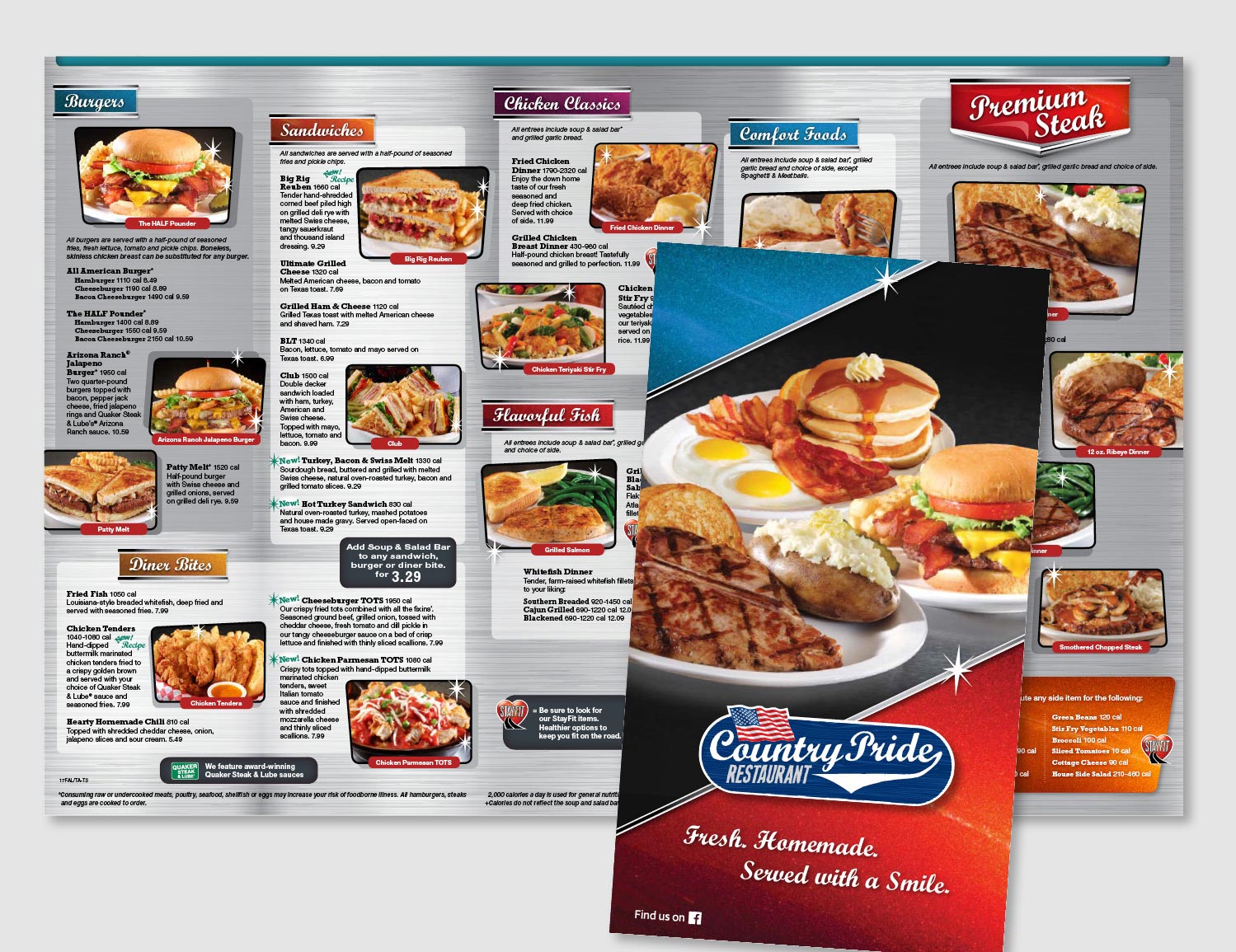
The new Country Pride menu features a diner theme with a brushed steel background, metallic colors, headings that resemble car emblems, retro shaped image frames and sparkle highlights. All of these design elements play into the "Homemade in the USA" entrees that are offered.
work completed for Full Circle Creative
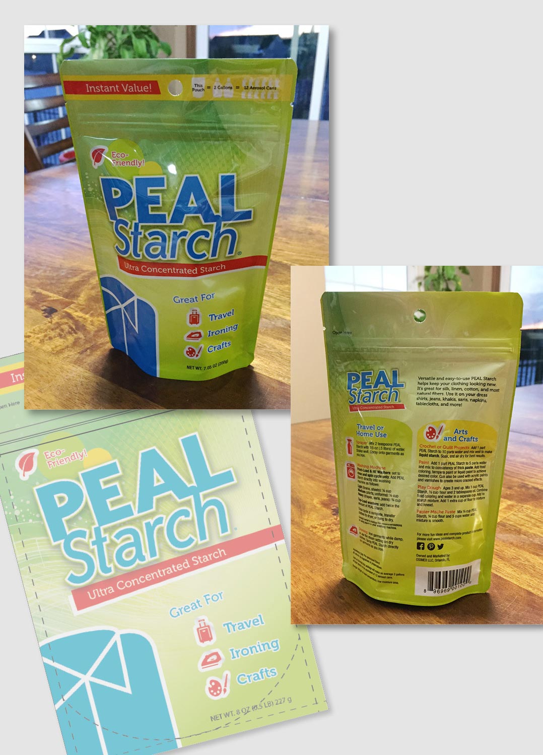
Peal Starch, a brand of clothing starch needed an updated package and wanted to focus on its multiple uses or benefits...ironing, crafts, travel, etc. I chose a bright color scheme that would be different than other packages on the store shelves and allow pertinent information to be called out. Icons were used to easily understand directions as well as possible uses for the product.
work completed for Full Circle Creative
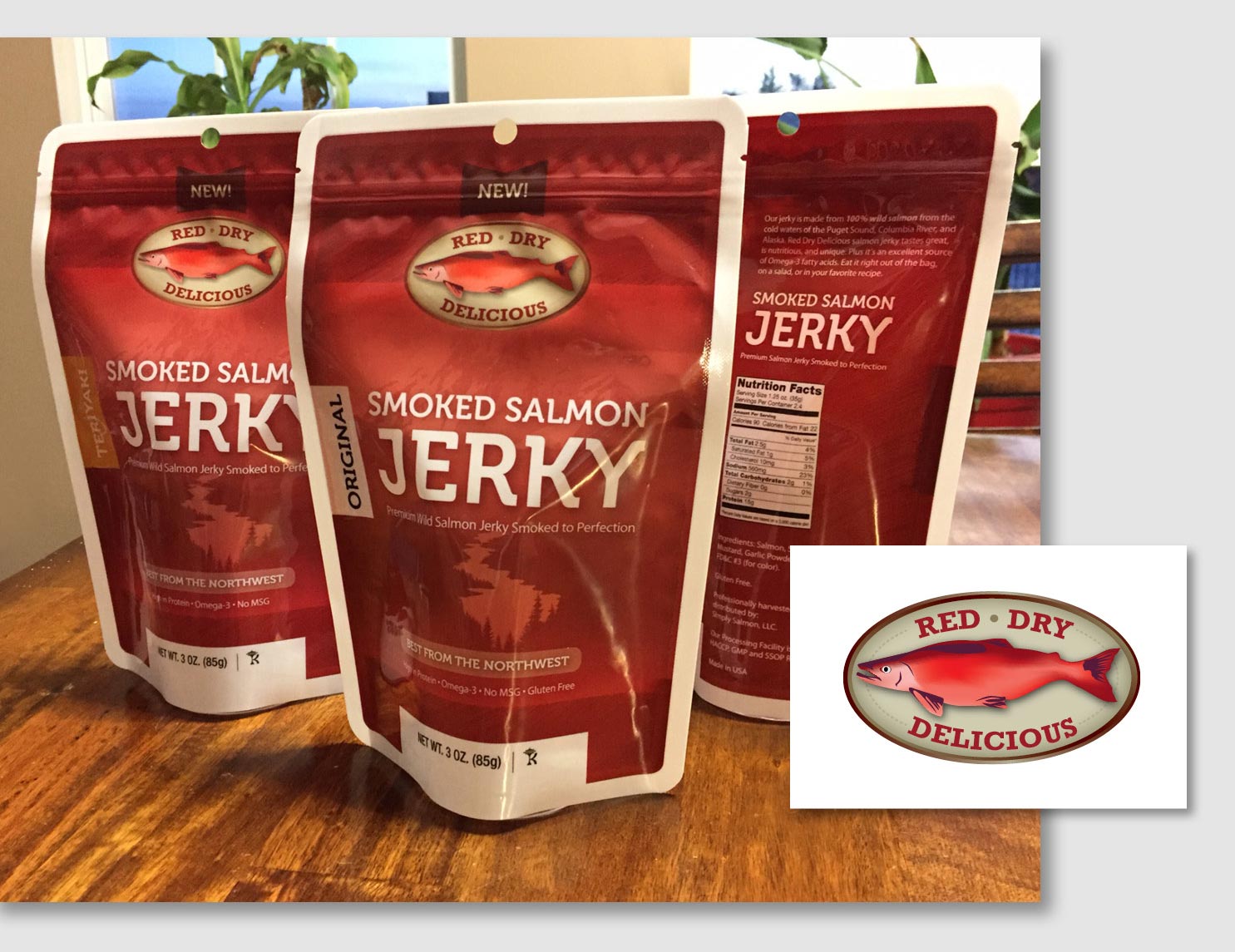
Red Dry Delicious, a new brand of jerky needed a logo and package design. The illustrated salmon stands out well in the olive colored oval shape of the logo. The mountains and streams where fish would be caught are a subtle background in the dark red/burgundy color of the packaging. This allows the logo and name Smoked Salmon Jerky to be easily read by consumers.
work completed for Full Circle Creative
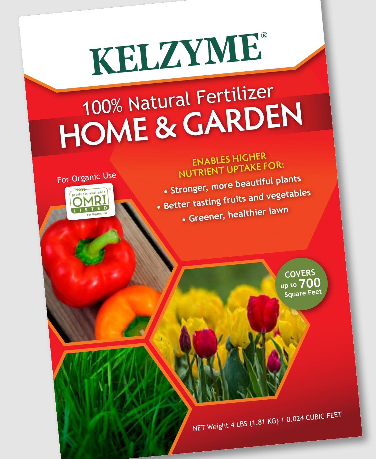
A new package design was created for Kelzyme. To highlight the benefits of their fertilizers, and eventually other products, hexagon shapes are used for the images. This allows each image to shine and can easily be swapped out for others pertaining to a particular product. The red-orange background balances well with the yellow, orange and green of the chosen images and allows the title and brand name to stand out.
work completed for Full Circle Creative
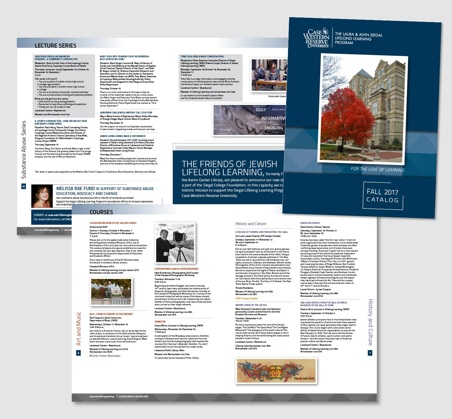
The Laura and Alvin Siegal Lifelong Learning Program of Case Western Reserve University is a continuing education program that encourages adults to attend classes, workshops, and lectures on different topics of interest. I redesigned the look of their semiannual catalog—organizing listings by category while including on-topic visuals to peak potential student interest. The look was created within Case brand guidelines but still allows the piece to stand on its own. I also designed many of the ads that are placed throughout the catalog.
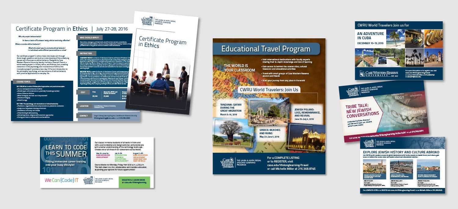
A selection of the many collateral and advertising pieces I've designed for Siegal Lifelong Learning. Pieces include: ads, mailers, postcards, brochures, handouts, flyers, invitations, banner ads, and more.
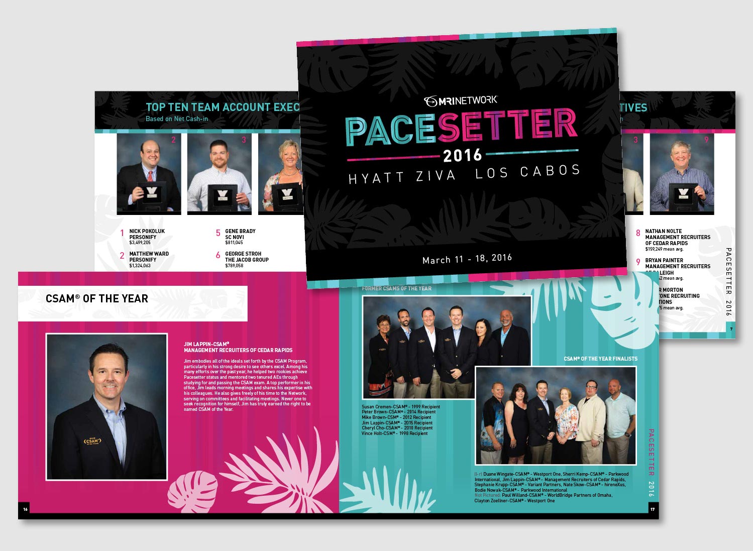
Each year the top recruiters and offices of MRINetwork are invited on a vacation getaway. A commemorative 32 page book is put together showcasing the award winners and events. The primarily black cover allows the teal and pink colors to pop on this award book design. The stripes and subtle leaf pattern ads texture to the look. These elements are continued on the inside spreads and featured awards and called out in the bright colors.
work completed for Full Circle Creative
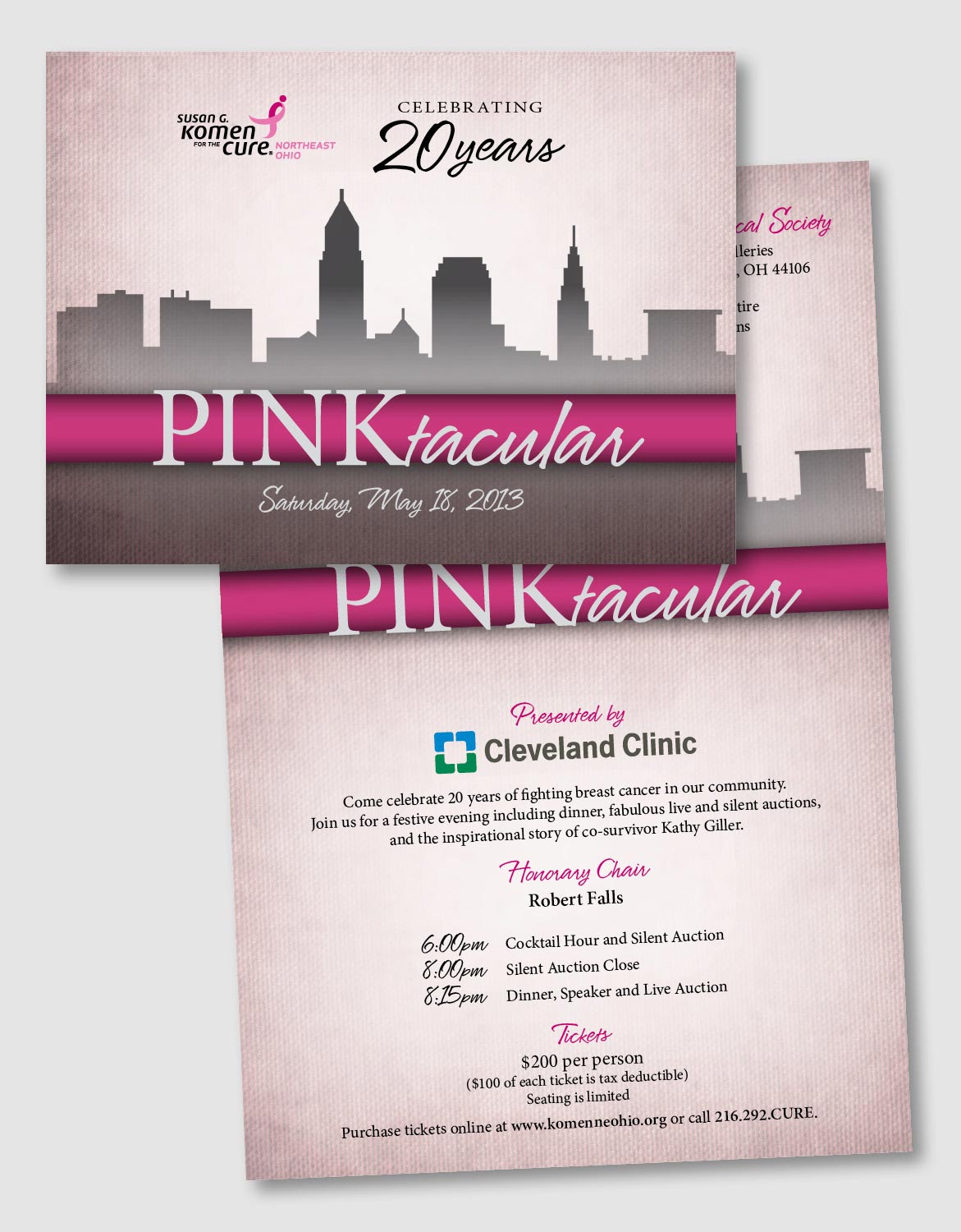
Pinktacular is a fundraiser of the Susan G. Komen for the Cure Northeast Ohio Chapter. Working off the skyline of Cleveland that had been used in race collateral, this invitation design has more of a sophisticated feel. The textured, muted pink background allows the bright pink ribbon and logo to stand out.
time and costs were donated as a contribution to this fundraiser
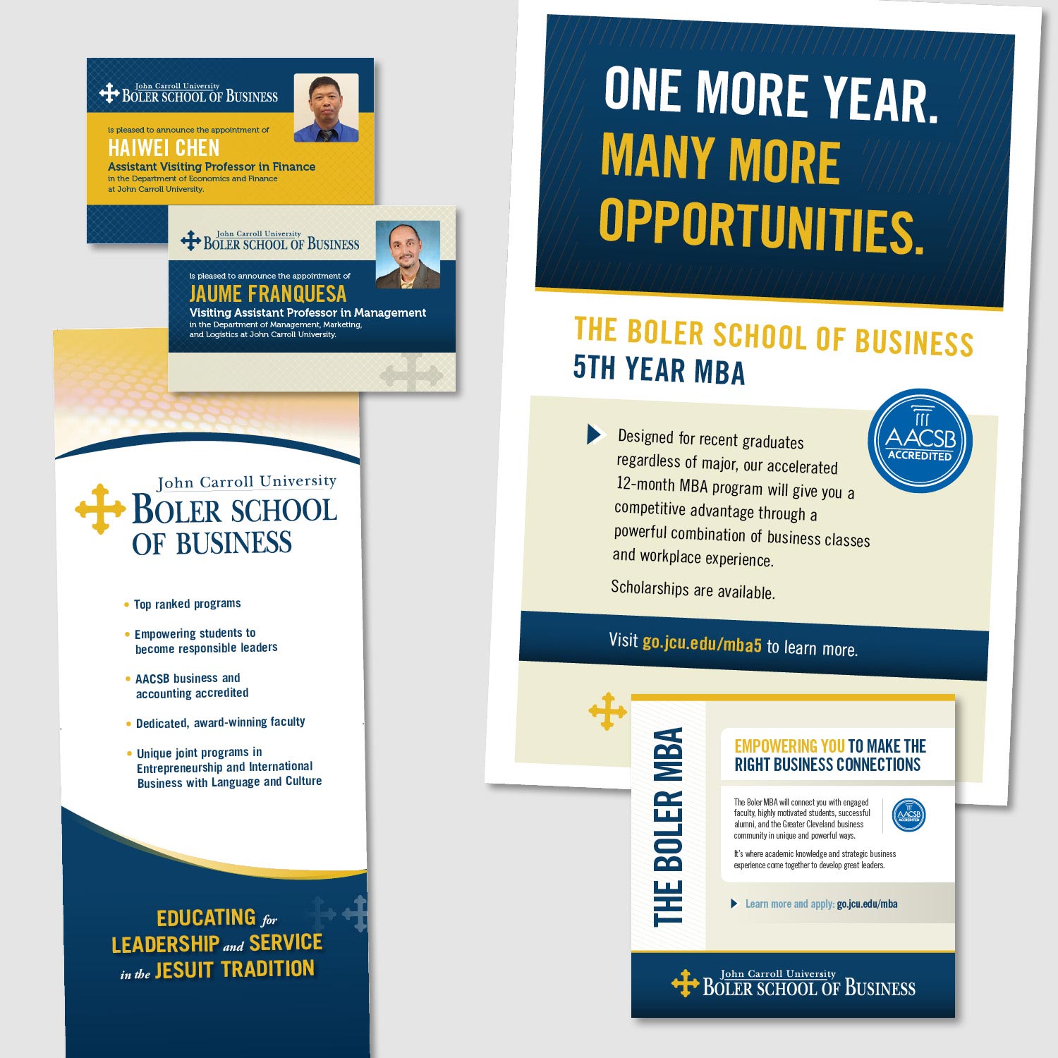
Working within brand guidelines and colors, I designed multiple layouts for the Boler School of Business at John Carroll University. Pieces include: ads, posters, banner stands, postcards, and more.
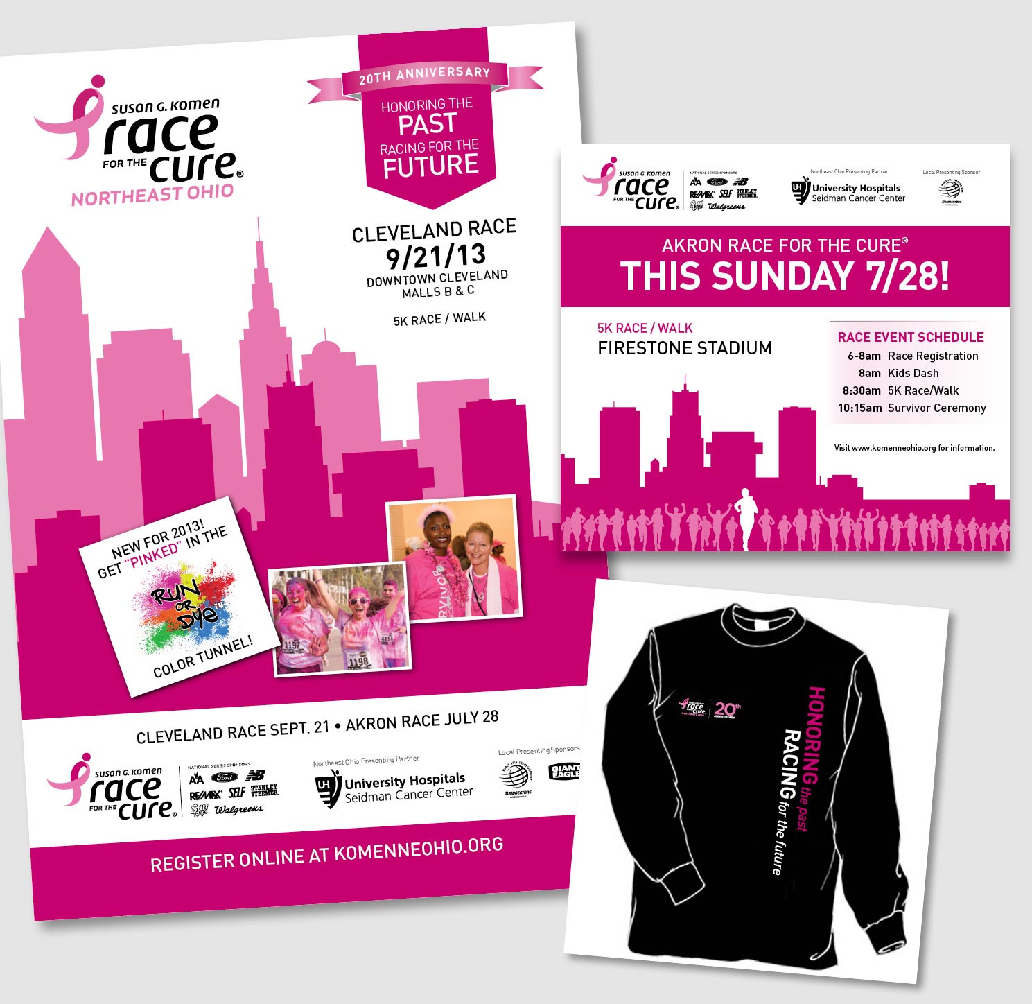
A number of pieces were created to promote the Susan G. Komen Race for the Cure Northeast Ohio Chapter events—posters, pins, stands, brochures, ads, t-shirts, etc. The bright and light pink were pulled from the main logo and carried through pieces along with a bright white background. Both Cleveland and Akron skyline illustrations as well as images or illustrations of runners and participants brought attention to these fun yet important fundraising races.
A sampling of logos I've created showing a variety of type styles, illustrations and colors. Each logo showcasing the unique company or program that they were designed for.

I was asked to create layouts for PowerPoint that would be used for the Professional Development Program at John Carroll University. The interesting color scheme along with illustrated professionals and directional shapes help viewers follow along the presentation.
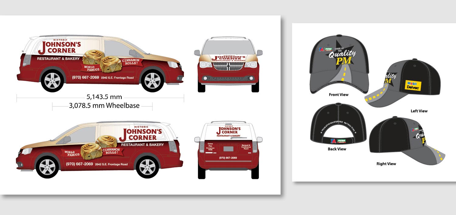
The Johnson's Corner vehicle wrap and TA and Petro cap are two projects where I needed to think of a design from multiple angles. Each view is appealing and works to sell the clients message.
work completed for Full Circle Creative
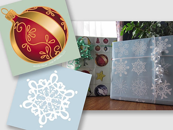
Master Printing, of Cleveland, printed and assembled wrapping paper as a gift for their clients just in time for the holiday season. Local designers were asked to submit ideas relating to four themes - toys, angels, snowflakes and ornaments. My family and friends enjoyed receiving presents wrapped in this fun paper with a special personal touch.
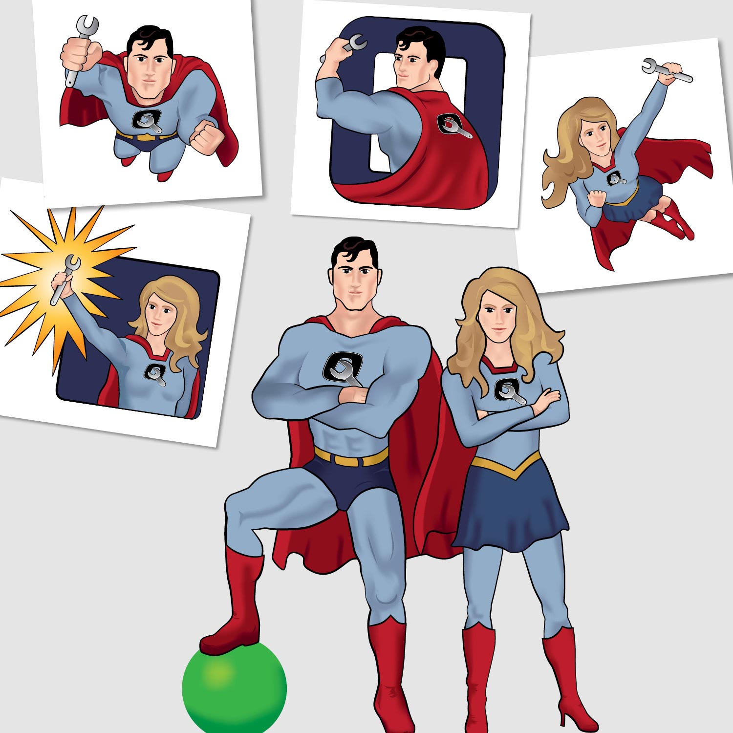
Captain Q-Force and Q-Force Girl were illustrated for TA and Petro Truck Service promotions. Each character was developed and then shown in a variety of poses to provide options.
work completed for Full Circle Creative